Understanding color theory for custom eyeshadow palette
Understanding color theory is essential for creating a harmonious and visually appealing custom eyeshadow palette. Color theory helps you understand how colors interact with each other and how different combinations can create various effects. Here’s a breakdown of color theory concepts for designing your palette:
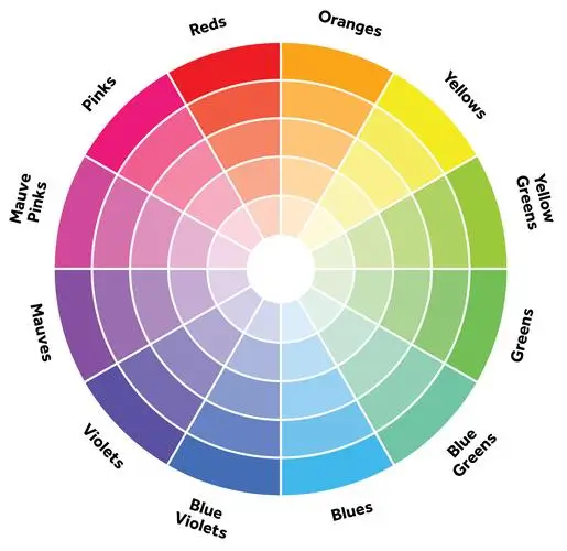
1. Color Wheel
- The color wheel is a circular diagram that organizes colors based on their relationships. It consists of primary colors (red, blue, yellow), secondary colors (orange, green, purple), and tertiary colors (a mix of primary and secondary colors).
- Understanding the color wheel helps you identify complementary, analogous, and triadic color schemes for your palette.
2. Color Harmony
- Complementary Colors: Colors that are opposite each other on the color wheel. They create contrast and vibrancy when used together. For example, purple and yellow, or blue and orange.
- Analogous Colors: Colors that are adjacent to each other on the color wheel. They create a harmonious and cohesive look. For example, yellow, orange, and red.
- Triadic Colors: Three colors evenly spaced around the color wheel. They create a balanced and dynamic palette. For example, red, blue, and yellow.
3. Color Properties
- Hue: The pure color without any tint or shade.
- Saturation: The intensity or purity of a color. Highly saturated colors are vivid and bold, while desaturated colors are muted and subtle.
- Value: The lightness or darkness of a color. Lighter values are closer to white, while darker values are closer to black.
4. Neutral Colors
- Neutral colors, such as black, white, gray, and brown, are essential for balancing and grounding a palette.
- They can be used as transition shades, to deepen or lighten other colors, or as standalone shades for a subtle look.
5. Color Psychology
- Different colors evoke different emotions and associations. Consider the psychological effects of colors when designing your palette.
- For example, warm tones like red and orange can convey energy and passion, while cool tones like blue and green can evoke calmness and tranquility.
6. Color Temperature
- Colors can be categorized as warm or cool based on their undertones.
- Warm colors (red, orange, yellow) create a sense of warmth and energy, while cool colors (blue, green, purple) evoke a sense of calmness and serenity.
7. Texture and Finish
- Consider not only the color but also the texture and finish of the eyeshadows in your palette.
- Matte shades are flat and without shimmer, ideal for crease work and defining the eyes.
- Shimmer shades add dimension and shine, perfect for highlighting the lid and inner corner.
- Metallic shades are highly reflective and offer a foil-like finish, adding drama and intensity to eye looks.
- Glitter shades contain larger glitter particles and provide sparkle and glam to eye makeup.
8. Contrast and Depth
- Utilize contrast and depth in your palette to create dimension and interest in eye looks.
- Pair light and dark shades to create depth and contour the eyes.
- Contrast matte and shimmer shades for balance and visual impact.
By applying these principles of color theory, you can create a custom eyeshadow palette that offers a diverse range of colors, textures, and finishes while ensuring harmony and cohesion in your eye looks. Experiment with different color combinations and techniques to unleash your creativity and design a palette that reflects your unique style and personality.